.avif)


Data reports are one of marketers’ hardest-working assets. Name another format that can fuel months’ worth of articles, become a compelling hook for social posts, capture media headlines, and claim a spot in your CEO’s earnings call talk track.
That repurposing power is one reason why B2B marketers say original research and industry benchmarks are most likely to drive the highest ROI for their teams, according to Datalily ‘s 2026 State of Data-Driven Content Marketing Report.
But your research is only as strong as the story you tell. Finding distinct narratives from a pile of numbers starts with robust data analysis.
Even if your organization is fortunate enough to have in-house data scientists, those folks are usually drowning in requests from different teams. (Which may be why two-thirds of marketers outsource analysis altogether, also from our report).
Whether you’re charged with managing analysis internally or partnering with an outside vendor, it’s important for B2B marketers to understand the process at a high level.
1. Remember the big picture
It’s tempting to dive into analysis once you get your data back. But this is when it’s important to pause.
Go back to your research brief. Refamiliarize yourself with the overall goals for the project. Is your main KPI lead generation? Customer engagement? Media coverage? The answer will influence which findings to prioritize as you work through analysis.
You should also review your original assumptions and predicted research headlines. This context will help you organize your data for efficient analysis, and more easily see which findings confirm or conflict with your initial hypotheses.
2. Make sure your data is analysis-ready
Wrapping up data collection is always a sigh-of-relief moment, whether you ran a quantitative survey or aggregated product insights. But that data isn’t quite ready to act on yet.
First, you need to make decisions about where analysis will take place. For example:
- Your survey platform: Tools like SurveyMonkey, Qualtrics, and Pollfish have built-in analysis tools, but these vary in user-friendliness and may be off limits depending on your organization’s license.
- A marketing data analysis platform: Using Flowerplot, a data analysis tool for marketers, directly sync your data from your survey platform, then analyze and explore insights using AI. First, check if Flowerplot supports your survey platform, or format your CSV then upload it.
- Spreadsheets: If you analyze data in a spreadsheet, you’ll want to create multiple tabs in order to get an isolated view of each question (and to create pivot tables for cross-tab analysis.)
- AI: If you opt to use an LLM like Gemini or Claude, make sure your data is in one tab of a CSV file, which takes up less storage. Include clear row and column labels throughout to help with prompting later.
This is also the time to consider what comparisons or filters you’ll want to analyze. Drilling into specific segments often reveals more interesting angles than analyzing top-line responses alone. For example, if you included a question about age, now is when you can group respondents by generation. If you asked a question about company revenue or employee count, you may want to categorize responses into small business, mid-market, and enterprise groups instead.
3. Review the top-line data
Now it’s (finally) time to analyze. The best place to start is going over the full respondent set, your “top-line” data, to gut check your original assumptions, and flag unexpected angles.
Remember: Not every data point has to make it into your final product. Here are a few ways to make the most of top-line analysis:
- Compare questions against each other: Looking at each question in isolation tells a partial story. Pairing responses from related questions can highlight (good) tension. “80% of CMOs are prioritizing AI adoption within their teams” is a serviceable stat. It becomes a story when paired with a conflicting insight, for instance, “Only 10% of CMOs make AI enablement resources or training available to their employees.”
- Consider percentage changes: It’s also important to draw comparisons within a specific question, especially for rankings and multi-select options. That same stat about CMO priorities could be expanded to something like, “80% of CMOs say AI adoption is a top priority, 50% more than the next-highest priority.” This is the formula to follow: [(New Value – Original Value) / Original Value] * 100
- Bring in AI: LLMs can be a marketers’ MVP for analysis. Start with role-based prompts that give AI relevant context (e.g., “You’re an analyst for a social media management vendor reviewing a survey of 5,000 global consumers about how they interact with brands on social.”) From there, you can ask AI to distill themes from the data, highlight takeaways from specific survey questions, identify which cross-tabs to examine next, or even summarize open-ended responses. But remember, always fact check AI analyses. These tools often hallucinate or make math errors, so don’t use AI outputs as facts.
4. Dig into cross-tabs
Analyzing top-line data only gets you so far. Next, revisit those segments you defined in step #2 (e.g., region, generation, company size, or level of tech adoption) to uncover more granular insights.
If you’re using spreadsheets, create pivot tables to zoom in on cross-tabs. The example below breaks out customer satisfaction scores by age group.
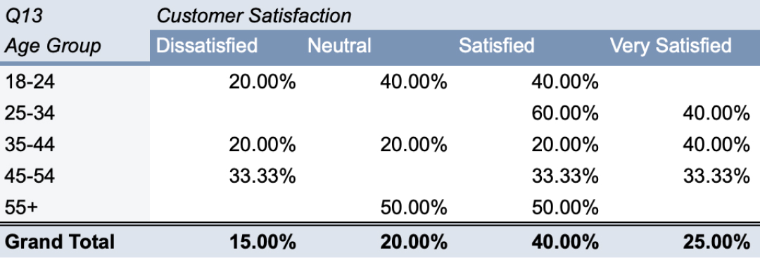
Pivot tables get the job done, but they’re text-heavy and tough to manipulate if you’re not a data science pro. Fortunately, there are marketer-friendly alternatives.
A tool like Flowerplot offers a visual interface for exploring survey data. You can quickly compare segments, filter to see one sub-group, and chat with your data to understand interesting takeaways.
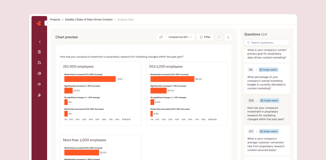
No matter which tool you use, keep in mind that correlation does not equal causation!
Spotlight: Klaviyo 2026 AI Consumer Trends Report
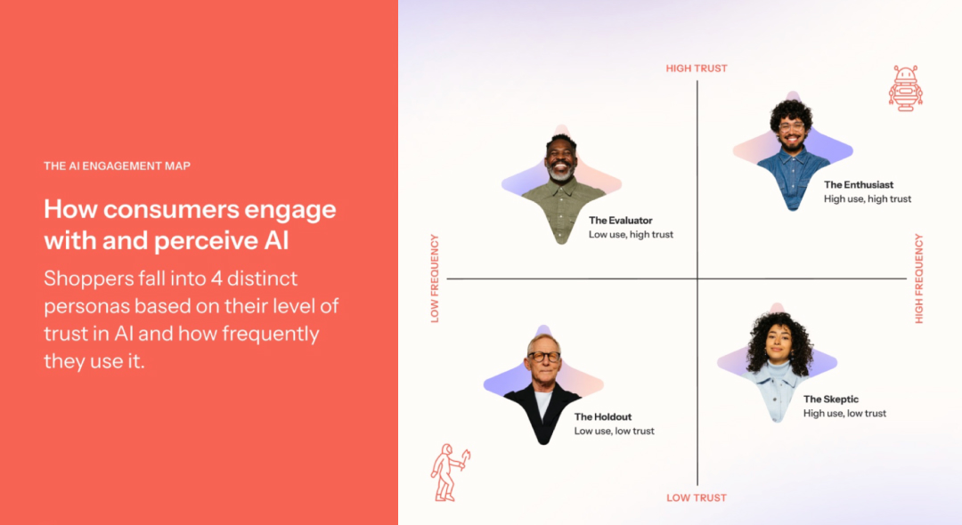
When B2C CRM brand Klaviyo set out to conduct research about how consumers use AI for shopping, they built their entire report around cross-tabs. Rather than paint a broad picture of shoppers, Klaviyo segmented their data into four personas (based on AI adoption and comfort level). This differentiated the content in a sea of brand-led AI data, and made the end result more valuable for their audience.
5. Compare your findings with previous data sets
Analysis shouldn’t stop at your current data set. If your original research is an annual, quarterly, or monthly effort, you’re sitting on a priceless library of information.
Where possible, note how certain data points have changed (or held steady) over time to create benchmarks that tell a larger story. Keep in mind that this is most effective when your data set or audience is relatively consistent (e.g., you continuously survey North American consumers or B2B CMOs).
Spotlight: HubSpot’s annual State of Marketing report
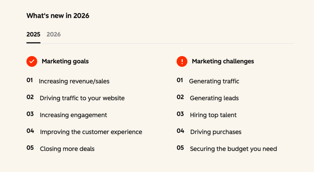
Agentic customer platform HubSpot has a renowned content and media engine, and their research is no different. For years, the company has published an annual State of Marketing Report that highlights marketers’ top challenges, priorities, and opportunities for the year ahead. Each report typically includes a nod to the previous year’s research, demonstrating how fast marketing trends evolve.
6. Round out your analysis with qualitative insights
Don’t limit the analysis process to your quantitative data. Incorporating qualitative, expert commentary adds depth to your stats, lends credibility to your findings, and can extend your promotional engine later on.
You don’t need to invest in focus groups to get these insights. (Some may already exist in other content or internal documentation.) Valuable commentary sources include:
- Internal leadership
- Customer communities and case studies
- Corporate partners
- Industry subject matter experts
Spotlight: Rippling’s State of AI in HR research
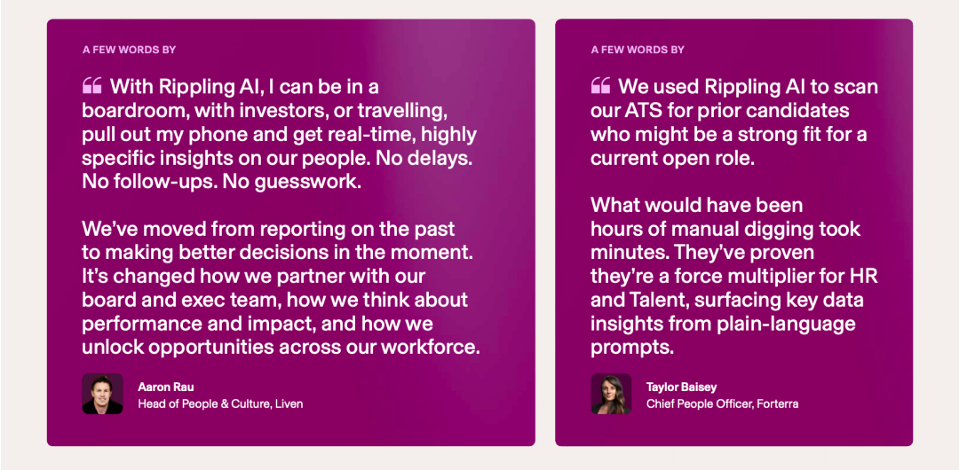
To coincide with a new product launch, workforce management platform Rippling published a data report benchmarking the current state of AI use among HR teams. The team didn’t let the data stand alone. The report incorporates multiple voices: Rippling executives commenting on the state of the industry, HR thought leaders’ perspectives, and customer testimonials.
7. Outline your data story
You’ve reviewed your top-line data, exhausted all relevant cross-tabs, compiled thoughtful quotes. You probably have more material than you need.
Creating an outline (instead of jumping into drafting) lets you start making sense of all your findings. This is where your story starts taking shape. Now is when you can confirm:
- Do we have the right mix of data types, especially to inform standout visualizations?
- Are we striking the right balance between qualitative and quantitative insights?
- Should this data come to life through one hero asset or multiple atomized pieces?
Powerful research starts with thorough data analysis
Nearly one-third of B2B marketers plan to invest more heavily in original research this year, according to our 2026 State of Data-Driven Content Marketing Report. Your approach to data analysis dictates the returns you see.
Learn more about how Flowerplot can help find your story faster, no data science experience required.