.avif)

The guide to data visualization in marketing
It’s one thing to present research findings, but it’s another thing entirely to tell a story with data. And data visualization is a major challenge for marketing teams.
With 86% of B2B SaaS marketers planning to increase their investments in proprietary research in 2026, the demand for custom data visualizations is only going to increase.
The typical original research process for marketing teams may look like:
- Source data from internal data teams, or market research firms
- Write content and include data visualizations or data callouts
- Design content and supporting assets
But there are massive gaps in this process. If data teams are disconnected from content teams, the marketer or copywriter may need to create charts manually. And if the designer is disconnected from the content and data teams, they may need to manually input the data when creating charts which is tedious and leaves room for error.
And overall, if team members aren’t skilled in data analysis, they may be treading water trying to pull insights into a cohesive story, then decide what to visualize, what’s interesting to add to the piece in general, and what to include in copy.
“Visualizing data in a way that tells a story requires a deep understanding of the context, the audience, and the brand. Most of the current data analysis tools out there only offer very basic branding and customization, so designers need to spend time building custom visualizations, which is time-consuming and can be challenging for new designers.”
From the State of Data-Driven Content Marketing
Here are some of the key principles of data visualization in marketing, and ways to streamline the process to create better data-driven content.
1. Start with quality data
When you’re telling data-driven stories in marketing, the data you use is the foundation for everything you create. Make sure that your data is accurate, cleaned up, and ready to go to a marketer or designer.
Some tips for cleaning up your data include:
- Rounding numbers and percentages to the nearest whole number
- Shortening or simplifying text to make it easier to add in designs
- Including keys or axis labels
- Sharing data and charts that designers can copy and paste, rather than screenshots
- Providing recommended chart types based on the type of data
Work with a data analyst or data scientist to pull out the most significant findings, and make sure to include disclaimers when sample sizes are small.
2. Know your data types and choose the best data visualization formats
Different data types should be visualized differently. For example, if you have categorical data comparing groups, you’d want to show them on a grouped bar chart, rather than multiple individual bar charts.
Using the most appropriate visualization helps the reader more easily interpret the meaning, and quickly find patterns so they can understand the takeaway.
Here are the most common data types, what they mean, and the best data visualization types for each:
3. Use the best tools for marketing data visualization
When you’re approaching data visualization for marketing, there are additional considerations that you wouldn’t have when conducting research for academic purposes or internal presentations. You need to make sure your data visualizations are on-brand, easily digestible, and work with the content formats you’ll be producing.
First, think about what types of data-driven content you’ll be creating, like a PDF report, web-based report, one-pagers, interactive landing page, social media posts, videos, or blog posts.
Then, consider the data visualizations you’re working with. Will you need to create bar graphs, tree maps, heatmaps, line charts, pie charts, or bubble charts?
Finally, explore the different tools you have available, and which ones will lend themselves to the task at hand. For example, if you’re creating an interactive, web-based report, you’ll need a data visualization platform that allows you to embed live graphs on the page. And no matter what, as a marketing designer, you’ll want a tool that has advanced branding and customization features, like using your brand font, colors, and styles.
You’ll also want to consider how you can upload your data into your visualization tools. Many tools require you to add the data manually for each chart.
According to Datalily’s 2026 State of Data-Driven Content Marketing report, these are the most popular tools marketing teams use for data analysis and data visualization for content marketing:
- Google Sheets: 66%
- Excel: 65%
- Google Data Studio/Looker Studio: 63%
- Canva: 58%
- Adobe Creative Suite: 57%
While many of these tools are familiar, and accessible, they still require a lot of manual work. But new tools offer more features built for marketing teams that work with data, like Flowerplot (beta coming soon!)
AI data visualization tools are cropping up, too, but it’s still early days. Currently, 57% of marketers use AI data analysis tools, and 52% use AI image or video generation tools, but only 13% report that AI has been most beneficial for visual content generation.
4. Understand the best practices of data storytelling
Nobody wants to read a data dump. Naturally, we look for patterns and skim through original data reports to find the most meaningful information, and it’s more impactful when that story is clear.
In data storytelling, remember:
- Every visualization should tell a story.
- Don’t repeat information between the copy and visuals — add to the visuals with commentary or point out why it’s interesting.
- Create a narrative with your data.
- Add benchmarks and comparisons to put data in context.
- Guide your audience to the “so what?”
- Keep it simple, don’t make charts unnecessarily complex.
- Use color intentionally.
- Make sure your visualizations are accessible. Use colors with sufficient contrast, legible font sizes, and responsive designs that work across different devices.
- Include clear labels.
Real examples of effective data visualizations in marketing content
Check out some examples of different types of data visualizations in marketing reports.
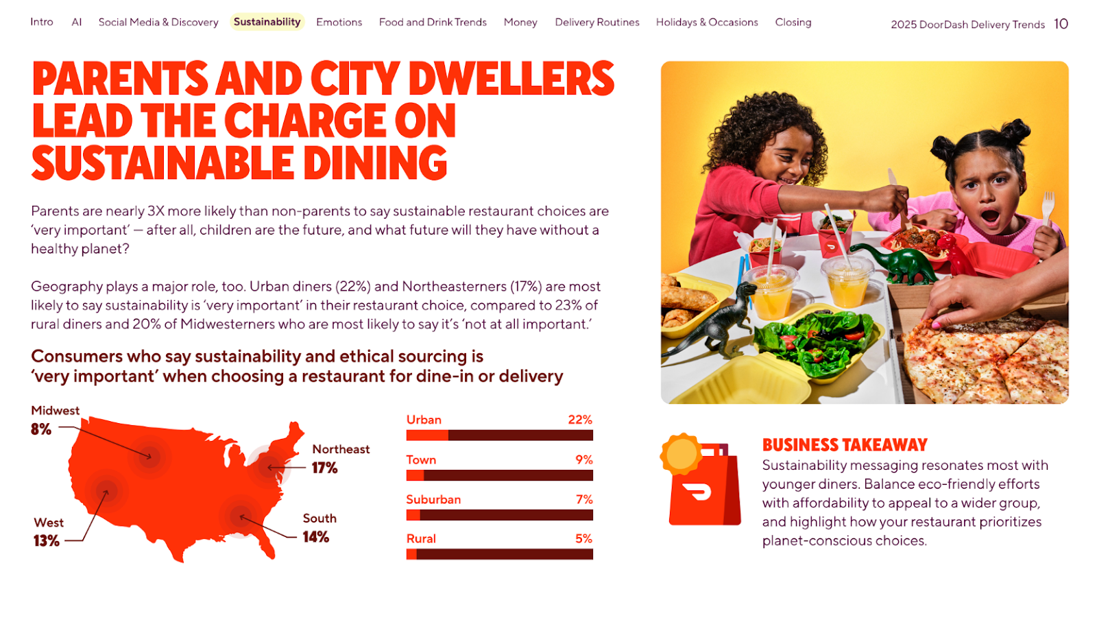
In the DoorDash Delivery Trends report, we used a map to display geographic data, and got into the more detailed insights in the surrounding copy.
In the HubSpot State of Marketing report, we used a grouped bar chart to compare B2B vs. B2C data, and included a clear key to explain the data.

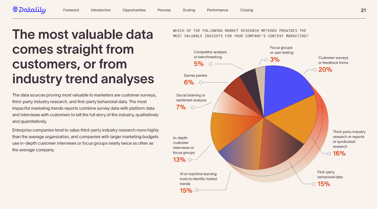
In the Datalily State of Data-Driven Content Marketing report, we used a pie chart to show the breakdown of a survey question where respondents had to choose one answer.
Data visualization is a skill that will only become more valuable in the near future
Two-thirds of marketing teams (67%) currently outsource visual content generation for data-driven marketing campaigns — and it’s the #1 most outsourced part of the marketing research process.
As a marketing designer or content marketer, you have a chance to stand out by becoming an expert in data visualization and storytelling.
With practice and upskilling through courses, you can turn spreadsheets and raw data into compelling stories that help drive revenue.
Take a look at our latest report on original research in content marketing, and explore some existing data-driven content for inspiration for your next campaign.
